I could assert that the first characteristic most people notice when laying eyes on most anything, including a handmade piece of pottery, is its color. The color can compel you to stop and note the form, drawing you in to glimpse the details, or drive you to keep on walking if its hue doesn’t strike your fancy. Color is important to us. Whether it’s the first feature we notice or the fourth, and whether we like less or love more, it can be the deciding factor towards a purchase.
Over five years ago (when I switched from cone 10 soda reduction to cone 7 electric, which means everything from my clay to glaze color to surface quality changed), I did months of testing to create my current palette pictured above (clockwise from top right): Ivory, Frost, Honeycomb, Lime, Rosa, Blackberry/Garnet, Grape, Caramel and Cornflower blue. Because of necessity and aesthetic interest, I’m in the exciting (and exhausting) throws of testing once again to re-vamp my entire glaze palette.
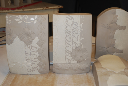
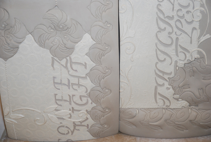
I began this new round of testing with specific colors in mind, but since glaze is nothing like paint (i.e. what you see is not necessarily, even rarely, what you get), allowed process and discovery to sway those expectations. There are a variety of thoughts that swirl through my head as I make the elaborate test tiles that mimic my pottery surfaces, weigh materials while donning my Darth Vader-sounding respirator, and stare at the resulting tests willing a small segment of tiles to call my name the loudest. See photos from my studio in the “Glaze testing” photo album on my Facebook Ceramics page here.
 First, as I am the person who by far spends the most time with my work, I need to like the colors I choose. Sounds obvious, but if I didn’t need to like the color, my palette (and pots for that matter) would be quite different. (All potters are aware of a handful of colors that have a higher probability of sale, thus the name Cash Flow Blue for a particular cobalt glaze.) However, salability doesn’t win over likability for me as the maker.
 So as a lover of color, it won’t be in my palette if I don’t love it, but the close second in my decision-making is needing you —my collectors, buyers and supporters— to also love one or many in my palette. This point also plays into the reason I have, and will continue to have, so many colors. I would be bored to tears if I was surrounded by only one, two or even three colors, finding it impossible to pick so few anyway, but variety is a way of broadening my audience-base while also attaining my first criteria above. Converse to my ruling out colors of which I’m quite fond because their audience-interest would be too narrow, by increasing the kinds of color (lights to darks spanning the color wheel) I offer, I can potentially garner more clientele than if I only sold green pots, for example. So, I do recognize and appreciate the need for balance between my taste and that of my customers.
There are many more important considerations in choosing color, but their rank is indecipherable to me after those first two key criterions. So in no particular order, I also consider:
 The color should compliment the style, content and vision of my work, which of late means a lean toward “light-hearted,” infusing some modern merriment into my Victorian modern style.
 The individual colors should work together as a whole (including underglaze stripe and dot colors) to create a pleasing palette when the work is grouped in my online stores and brick-and-mortar galleries.
 I like there to be a balance of lights and darks, softs and brights, and colors on the wheel for variety as well as photogenic potential. (I’d say it’s a truth that images are more broadly “consumed” than product.)
 There are colors (like purple and gold, and more recently, blue) that I’ve used for a while that feel like “signature” colors (i.e. colors my audience expects and enjoys on my work), so I like to continue those in some way for, well, continuity.
 I try to be thoughtful of colors that suit the function. From food to flowers, I want to have colors that feel suitable to the use I put forth in the pots. (Not all the colors will work for both tortellini and tulips, but I like all to work for some.)
So! The image above illustrates a grouping of potential new colors in the front row (also in swatches below), and most of my current palette in the second row of tiles. I included some of my finished pieces with the stripes of Red, Lime, Light blue and Tangerine in the background to show how those warm bits of color will continue, and play with the new colors.


In addition to deciding on the colors themselves is the need to name the colors! Since everyone conjures up a different mental picture for the simply named “blue,” for example, I seek to find short names (usually relating to fruit, flowers or nature in general) to conjure the right “color flavor.” Here are some names I’m leaning towards for now, and may ask for your help with in the future!
First row: A. Honeydew, B. Gold or Golden, and C. Kiwi/Dark Celadon/?. Second row: D. Apple green/Citron green/?, E. Aqua, and F. Sky/?. Third row: G. Ocean/?, and F. Violet/?. There are more tests to do (I have the glossies to tackle next!), decisions to be made, and several months to pass before new colors begin to appear, but stay tuned as the odyssey continues!
 P.S. My humble take on color trends. It’s not very feasible for most potters to change colors seasonally or according to trends put forth by Pantone (a company I love) or other color moneymakers. (Should color trends apply to art unless it’s a commentary about color trends anyway?) Some ceramic artists use brushable glazes, which would actually make both change in color as well as vast numbers of color possible. All my pieces, however, are dipped in 5 and 10 gallon buckets of glaze. This volume of material means that there is both a physical (or rather spatial) and financial restriction to change as well as numbers of glaze. (I mentioned earlier that my current glaze palette began with nine, but all of my glazes have a glossy counterpart that I use on the interiors and as accents, so the number is actually double!) This is in addition to the length of time required to test and find new colors. So, I’m aware of trends and their potential but they’re too finicky and fleeting for me to follow with my current techniques and logistics.
If you’re on Facebook, I regularly post a pic, link or blurb here on a weekly basis —like images in the “Glaze testing” album— if you’d like to keep up with my work and studio in between my blog post musings. You can also subscribe to this blog in the upper right column under the heading Blog Subscription so that new blog posts go directly to your email inbox and you won’t miss a thing!