C O L O R


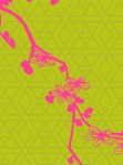
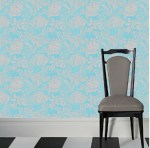
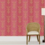
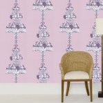
First row, left to right: Mark Rothko painting No. 22, 1949, 1920s Chicago Transit Authority poster, and Bev Hisey Reflective Folk CushionSecond row: autumn leaves, Andrew Zuckerman bird photograph and my warm-toned glazes;  Third row: Berlin Festival of Lights, Dave Jordano Storefront Church photograph and a Sevres potpourri vase;  Fourth row: Andrew Zuckerman Masked Lovebird photograph and my cool-toned glazes;  Fifth row: Hindu (Holi) Festival of Colours, JollyBe Chrysanthemums wedding cake, and peacock;  Sixth row: Cole & Son Dorset wallpaper, botanical print and Felissimo’s Colored Pencil SetLast row: KiBiSi chairs and a Viola Frey figure.

Oh, how I love color.

I suppose most everyone enjoys color, but if there were a 1 to 10 rating for color love, I would be at a 9 or 10 on the scale. I envy synesthetes and think about color throughout my day, in and out of the studio. I have a similar response to color that others do when they eat a piece of chocolate—that little butterfly feeling of yum.

Darks.

These tumbler images (above and below) represent the myriad of ways the nine colors in my palette can be placed together to give a completely different color feel.

Lights.

One of my grad school (MFA, Ohio U. 2001) professors, Joe Bova, recently commented to me that he believes “color is the most personal element in art”.  I certainly took a lot of time considering my color palette when I switched from high-fire soda (a more limited inherently glossy palette) to mid-range electric where the options are delightfully and overwhelmingly limitless.

Fruity.

I spent several months testing glazes to find both the color and quality (“breaking” satin vs. glossy) that best suits my work and me.  There were several determining factors.  The first and most important is that since I spend more time around my work than anyone else, I wanted colors I enjoy.  I also wanted colors that work well together, that compliment each other.  Finally, I wanted a palette that gives my collectors options: some people prefer neutrals, some prefer brights, and I have both as well as what’s in between.

Autumnal.

Because my work is predominantly monochrome*, I don’t think it’s as recognized for its color because an individual piece isn’t particularly colorful (i.e. having multiple colors).  Though I am currently running some new tests to add stripes and dots of patterned color, “colorful” in my pots comes from their proximity to each other.  I love seeing which colors my customers pair, mix and match when they buy 2, 4 or 12 pieces.

Neutrals.

All of my glaze colors are warm-toned, meaning that even the cool colors (blue, purple and green) have yellow undertones.  The names I have given the nine colors are Ivory (an off-white that looks almost like leatherhard porcelain), Frost (the super pale turquoise that looks a bit like a celadon), Honeycomb (a pale, warm yellow), Lime (a fruity yellow-green), Rosa (a salmon-y, mahogany pink), Cornflower blue (a rich lighter blue), Grape (a warm, plum-y purple), Caramel (a very yummy gold brown) and Blackberry (a deep wine, purple-y red).
Naturals.

On most forms, the satin glaze is the most visible, but the interiors are lined with a glossy version of the outside color, so I really work with 18 glazes.  Some forms, like my bowls and serving pieces, reveal more of the glossy color.  I like the contrast of satin to shine, so in addition to keeping the food surfaces functional with a glossy glaze, it is an aesthetic choice too.

Romantic.

Choosing glaze colors is not like picking out paint (potters will sardonically laugh and nod at that statement) because there is chemistry, elemental change and heat involved.  Red and blue does not necessarily make purple in the clay world.  My color palette came from having a sense of colors I wanted ( a green, a purple, a red—one of the hardest colors to “get” in ceramics, etc.) and then testing to match that expectation with the possibilities paired with my clay, cost of materials, firing temperature and application, not to mention aesthetic goals.  As my husband would say, it’s tricky business.

Cools.

I gather inspiration for color from everywhere.  There are my “usual” sources (period clothing, Art Nouveau prints, Islamic architecture, etc.), but there are also more obscure suggestions for color, like the images at the beginning of this post.  Right now I’m liking the blue in the shadows of the snow, the transitional green from light to dark inside an avocado and I keep thinking of that orange that was in a room my husband and I stayed at in Iceland six years ago.

Festive.

I believe the color in my work is one of several elements which makes my pots unique.  I agree with my professor that color is personal, a way to relay an emotion or spark a memory.  It’s a fascinating subject.

*I tend to use one color or two similar colors on a piece because I feel this best shows off the form, where multiple colors tend to divide the form. Imagine a woman wearing a purple shirt, blue belt and yellow pants next to one wearing a purple dress.

My Sketchbook: Not Just for Sketches

KKActualSketchbookII KKSketchbook4_09 KKSketchbook11_08KKSketchbook11_08II KKSketchbook_09_weaves KKSketchbook_chinaKKSketchbook_layers KKSketchbook_lighting KKSketchbook_oldKKSketchbook_oldII KKSketchbook_WW_Queen KKSketchbook_yummy

More than half my sketchbook is made up of gathered images, making my sketchbook as much an idea book as a place to draw.  Collected images, often mashed-up and flipped around, have become an important part of my process and influence to my work.  When I teach workshops, I usually pass out my last sketchbook because I think it is just as important to see how an artist develops an idea (the origination of a form, texture or sensation) as it is to see a demonstrated technique.  I gather images from all over (magazines, catalogs, museum pamphlets, postcards, etc.) so it’s hard to know where an image came from or when, and while I’ve gotten pretty good at noting what is in the image, sometimes there are lapses, so if it’s not noted now, I didn’t note it before.

KKActualSketchbookII KKSketchbook4_09

First row: This is my current sketchbook (’08-present). I made it using coptic binding, sewn with black waxed thread, allowing it to sit flat when open.  I use duct tape to strengthen and protect the corner edges and signatures for studio use and travel. The outside is collaged with sections from soap boxes. The second image has pictures of women’s and boy’s Russian munisak robes from late 19th to 20th century mixed with architectural details from a contemporary home.  I put these disparate images together because I liked the highly ornate from one time period next to the minimal of another, and both carry ideas for pottery deco.

KKSketchbook11_08 KKSketchbook11_08II

Second row: This first image is a mixture of writing and animal drawings of mine for stamps, collaged with animals from a catalog and Deerfield, a sculpture by Anne Lemanski. The second are notes I jotted next to a variety of industrial design objects and furniture I find influential for form and detail, including Devils wallpaper by Waterhouse for Brunschwig & Fils; Bluffer fauteuil by India Mahdavi for Ralph Pucci; wire birdcage candelabra by The Conran Shop; Variér Eight chair by Olav Eldøy; Now Isn’t That Lovely #7 sculpture by Stephen Johnson; and My Beautiful Backside couch by Doshi Levien for Moroso.

KKSketchbook_09_weaves KKSketchbook_china

Third row: The left image is a pairing in textures.  I love the negative space in each, but I mostly enjoy the dense texture that creates each shape: Light of Tomorrow sculpture by Mimura Chikuho and Welcome the Cube black jacket by Giles Deacon for Fay.  The second image is a collaged influence mixture of manufactured china by Calvin Klein, Paola Navone, Royal CrownDerby and Royal Copenhagen with a photograph I took of a painting in a window storefront in Berlin.

KKSketchbook_layers KKSketchbook_lighting

Fourth row: In the first image, the first page shows the dining room in Donatella Versace’s Milan apartment with murals of Chinese vases and jars on the walls.  The second page is a collage of fabric and wallcoverings by Jakob Schlaepfer with Baccarat Apparat crystal cups and decanter by 5.5 Designers.  On each page, I like the layering and the “real” mixed with its 2-D version.  The second image shows my affection for lighting as influence.  I have both these George Nelson pendant lamps and this Murano glass chandelier (I love the other colors it comes in too) in two different sketchbooks, I like them so much.  They are purposefully flipped sideways and upsidedown to suggest other forms.

KKSketchbook_old KKSketchbook_oldII

Fifth row: The first image is actually an old pairing I use in my slide presentation and had on my studio walls for years.  I put the two together because both Art Nouveau advertising images and Haute Couture clothing are influences, and because their stance and gesture are remarkably similar.  On the left page of the second image is a magazine ad with imagery that becomes tattoo-like, collaged over with a bird I cut out from a friend’s card.  The layering and suggestion is something I would like to have in my work.  The right-hand page is also a very old magazine ad that has been on various studio walls and in my slide presentation.  I purposefully taped this upsidedown to change the context from a couture Miyake dress to the silhouette of a footed vase with striking shadows and pin-stripes.  A reminder to play and change my perspective.

KKSketchbook_WW_Queen KKSketchbook_yummy

Last row:  The left image features two well-known characters and actors.  The costume/dress of both Wonder Woman (a childhood hero of mine) and Queen Elizabeth have been influences because of  their decorative and structured forms.  The contrast and similarity of these two pictures of strong women is both humorous and striking.  The second picture is another interesting pairing that I have titled “yummy” in my mind.  The shapes are curiously similar, but what I appreciate in each is their very different take on extravagance, decadence and compound form.  A crystal chandelier on the left and a sculpture detail of Cherry Bodies by Nikki Renee Anderson on the right.

PS: A hazard of having a glass of (red) wine while doodling in your sketchbook is a spill that results in wrinkled and lavender-tinged page edges.

Perennial Influence

I couldn’t think of a subject for a new post, so posed the question (to myself), “What have you been thinking about?” I’m in a making cycle, bisqued last weekend, glazed all week for upcoming deadlines and commissions leading up to another firing, and have some new, big ideas, but what I’m really thinking about is my garden.

Agastache  Allium  Allium_bulgaricum  Astilbe
Baptisia  Crimson_Barberry  Bugbane  Dianthus

First Row: Agastache, Allium, Allium bulgaricum, and Astilbe
Second: Baptisia, Barberry, Bugbane, and Dianthus

I love flowers and trees, learning new things and being outside, but when we bought our home almost four years ago, my thumbs all but turned green. My Great Grandma, Grandpa and Dad were each avid gardeners (veggies and flowers), and I enjoy the feeling that I am continuing a family tradition in some small way. Other than the gorgeous results and insects and birds the perennials attract, my favorite part is the escapism. All I think about when I garden is the activity itself and “Ooooo, pretty, pretty.”

Dogwood_Red_twig  Echinacea  Blue_fescue  Fox_glove
Geranium  Hellebore  Heuchera  Heuchera_Red

First ro: Red-twig Dogwood, Echinacea, Blue Fescue and Fox glove
Second: Geranium, Hellebore, Heuchera bloom and Red-leaf Heuchera

I have discovered that I garden the same way I make pots: research and preparation balanced with a healthy dose of impatience and stubbornness. I wound up having little interest in planning, mostly choosing and placing plants together based on color, contrast and shape. As an artist, I seem to be drawn to unusual colors (loving deep purple and bronzed–leaf plants, for example, next to the chartreuse and limes), odd shapes (alliums and lupines) and rich textures. Gardening is the quintessential 3D design experience for me.

Hostas  Hydrangea_Pee_Gee  Lupine_flowers  Lupine_leaves
Japanese_Maple  Penstemon  Sedum  Switchgrass

First row: Hostas, Pee-gee Hydrangea, Lupine flowers and Lupine leaves
Second: Japanese maple, Pentsemon, Sedum and Switchgrass

One of my goals with the garden—other than mental relaxation—was to attract butterflies and birds.  I become giddy (yes, giddy) as new blooms bring big, clumsy bumblebees, darting ruby-throated hummingbirds, waves of monarchs, lazy tiger swallowtails and lone hummingbird moths (the insect I had never seen before having this garden).  Because the garden is so close to the house, lining the entire front porch, I can stand at the door in the morning when I brush my teeth, or sit out there in the evening with a glass of wine in hand, surveying the scene.

our-garden-808All this happiness certainly feeds my studio time, and I’m definitely aware of wanting my slip-trailed shapes to be outlined like an astilbe leaf, a glaze the color of a penstemon leaf, a stamp the radiating shape of a lupine leaf with droplets of water, a vase shaped like the waterfalling grass…
All images courtesy of my garden.

Artist Favorites

Shepard_Fairey_Mujer_Fatal_mural Martin_Puryear_Bower_80
Alphonse_Mucha_Summer_1896 Wayne_Thiebaud_Boston_Cremes_69 Claes_Oldenburg_Dropped_Cone_2001
Charley_Harper_Shadow_Dancers_1969 Chuck_Close_Lorna_Simpson_2006 Shepard_Fairey_flowervine_red_2009 
Charley_Harper_upside_downy_1988 Kehinde_Wiley_Encourage_2007 Anish_Kapoor_sky_mirror_2006 Piet_Mondrian_Composition_1936

From top left: Shepard Fairey, Mujer Fatal mural; Martin Puryear, Bower, 1980; Second row: Alphonse Mucha, Summer, 1896;  Wayne Thiebaud, Boston Cremes, 1969; Claes Oldenburg & Coosje van Bruggen, Dropped Cone, 2001; Third row: Charley Harper, Shadow Dancers, 1969;  Chuck Close, Lorna Simpson, 2006;  Shepard Fairey, Flowervine Red, 2009; Fourth row: Martin Johnson Heade, Brazilian Orchid, 1875;  Charley Harper, Upside Downy, 1988;  Kehinde Wiley, Encourage good manners and politeness; brighten up your surroundings with plants, 2007; Last row: Anish Kapoor, Sky Mirror, 2006; and Piet Mondrian, Composition, 1936.

These are some of my favorite artists: disparate and similar, spanning over 100 years.  The culminating traits I see here are: formal investigations of line, space and contrast; decoration; beauty; minimalism; poignancy; humor; attention to detail; and a desire for viewer attention and/or participation.  There is overlap of two or more of these elements I enjoy, and hope to have in my own work, in the work by each of these artists.  Good stuff.

Designer Wallpaper Influence

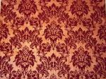
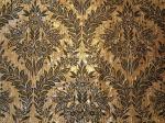
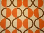
Hoodless_Blossom C&S_Selsby C&S_DorsetC&S_Opera C&S_Selsby_Flock_on_Foil C&S_Woodstock_FlockC&S_Willow_Garden Retro_Op-Art_Green_&_White_Floral Rosies_Pretty_Flower_PotsRosies_Dark_Red Rosies_Oriental Rosies_Black_FloralRosies_Mod_Circles

Not a big fan of wallpaper for the walls, I prefer looking to it for ideas of pattern and color meshings on clay. The textures and designs on these hand-pulled and vintage papers sure spark some ideas.

First paper: “Blosson in Moss Green & Fuschia Pink” by Suzy Hoodless.  Next six: “Selsby,” “Dorset,” “Opera,” “Selsby Flock on Foil,” “Woodstock Flock” and “Willow Garden” by Cole & Son.  Last six: “Retro Op-Art Floral,” “Pretty Flower Pots,” “Dark Red,” “Oriental,” “Black Floral,” and “Mod Circles” at Rosie’s Vintage Wallpaper.

Favorites & Influences from the PMA

After teaching my workshop last Thursday at a community college outside of Philadelphia, I spent a leisurely afternoon at the Philadelphia Museum of Art on Friday. It was my second visit, and I highly recommend it.  Larger images of the entire collection are posted at the PMA website (I could only snag the smaller to post here).  These are some of my favorite objects, many of which I sketched and noted in my little sketchbook for future reference and influence.

animals_in_diamond_delft chest_over_drawers compote
green_vase bird_on_a_trough candlestick_sevres coffeepot coffeepot_ri
cylinder_desk_and_bookcase document_box dressing_table_pa
footstool_american bird_tree giorgio_morandi_still_life_1946
interior_of_a_cafe jug_iznik lilac_blossoms
mj_heade pair_of_candelabra persian_tabouret
pillow_song side_chair_pa spice_box two_hares vase_on_brass_mount
vase_with_lid wardrobe
surtout_centerpiece sofa yuan_pillow

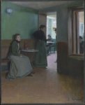
From top left, first row: Animals in Diamonds (Dutch/Delft tiles) c.1585 Netherlands; Chest over Drawers, Pennsylvania c.1792; Compote, c.1846 France for President Polk; Second row: Vase, Chicago Terra Cotta Works 19thc. Illinois; Bird at Trough, c.1850 Pennsylvania German; Candlestick, c.1761 Sèvres, France; Coffeepot, c. 1800 Pennsylvania German; Coffeepot, c.1899 Rhode Island; Third row: Cylinder Desk and Bookcase, c.1800 PA; Document Box (painted tin), c.1830 PA; Dressing Table, c.1715 PA;  Fourth row: Footstool, c. 1730 PA; Bird Tree, c.1810 Pennsylvania German; Still Life by Giorgio Morandi, 1946; Fifth row: Interior of a Café by Santiago Rusiñol, 1892; Jug, 17th c. Iznik, Turkey; Lilac Blossoms by Christiaen van Pol, c.1800; Sixth row: Orchids in a Jungle by Martin Johnson Heade, c.1870s; Pair of Candelabra designed by Louis-Constant Sévin, c.1862 France; Tabouret (Persian), early 13th c. Iran; Seventh row: Pillow, Song Dynasty (960-1127) China; Side Chair, c.1870 PA; Spice Box (Painted maple), c. 1870 PA; Two Hares in Moonlight by Cho Tai Eok, Chosòn Dynasty 18th c. Korea; Vase on Brass Mount (glass), c. 1910 U.S.; Eighth row:Vase with Lid, c. 1768 Sèvres, France; Wardrobe designed by Sir Ambrose Heal, c. 1910 England; Last row: Centerpiece (Surtout), Strasbourg faience factory, c.1729 France; Sofa (one of a pair) c.1725 England; Pillow, Yuan Dynasty (1271-1368) China.