
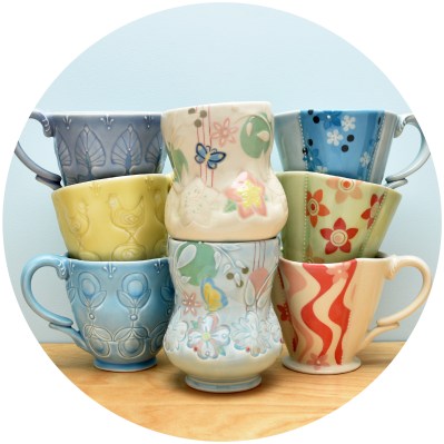
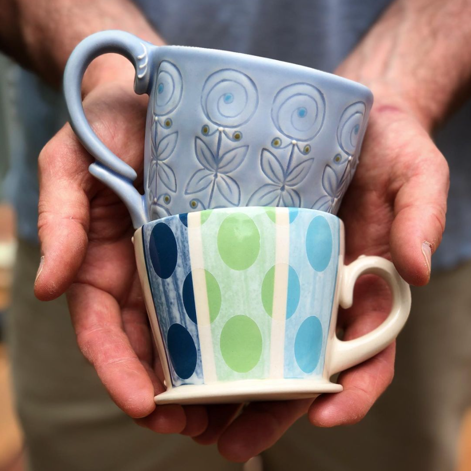
Kieffer Ceramics is high-quality, functional pottery intended to bring joy into your daily life & home décor designed & handmade in Massachusetts by studio potter Kristen Kieffer.
Sign up to receive infrequent updates & then see what’s new!
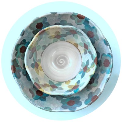
Kristen makes pottery that brings elegance, sophistication, and joy to the everyday. She has a diverse range of influences, and seeks to marry the splendor of past eras with our modern desire for beauty and utility.
Kieffer Ceramics At Home


Copyright Please ask before using images from this website.
The photos and work they represent are under copyright. Thank you.
All rights reserved © Kristen Kieffer Ceramics
